At least once a week, I am asked to comment on a LinkedIn profile picture. As an executive coach with a prior background in art (in addition to law), I base my opinion not only on good taste but also on the principals of photography and design.
I mentioned in my last post that I wanted to give my readers an opportunity to view and contemplate some LinkedIn-sized and styled pictures before giving my recommendations and highlighting insights that each one can teach us about our own profile shots. In this post, I have included many of those prior images and more.
There are some of the obvious points, such as good focus and high enough resolution, that we can all see (if we are paying attention). But what else could we do to make our images even better?
If you clicked on a LinkedIn profile for this person with the image below – full disclosure: all of these are samples from Adobe Images, not from real profiles – would you be inclined to connect with him or her?
I give some feedback below that can help you understand how to look at images more objectively and improve your own profile picture on LinkedIn.

Some people like to have “action shots” that show them in leadership roles. To that extent, the image above works. However, pointing off to the side of the image takes the viewer’s eye in that direction as well, and away from one’s image and profile generally. It also makes this person look closed off rather than approachable. Further, the words in the background are distracting and do not add any credibility (compare, for example, someone on the Tedx stage). That said, an action shot that is professional and well-done can sometimes work well.

A lot of things are done well in this picture. It is generally well-cropped – it could be a bit tighter at the top – and the person is dressed professionally. However, she does not look happy in this shot, and the lighting on her hair and background is distracting. This is the most common type of picture that I see, i.e., one that makes the person look “good enough” to be happy with the picture but nonetheless does not show him/her in the best light (literally and figuratively). Some people don’t like to show their teeth, but you can smile more with the eyes in that case.

The above picture has the same issue with the distracting lighting in the background, although the lighting on the individual is better. This woman has chosen to have her hand in the picture, which sets it off as a more individualized shot and may be appropriate for certain fields where someone is asked to connect with people emotionally. For example, a therapist or a fiction writer may benefit from an image like this. By contrast, a litigator who needs to show an ability to meet challenging situations head on would not want to have an image that is too “approachable” or “soft.”

Some people like to highlight their hobbies in LinkedIn profile pictures. Here’s my response. First of all, if you crop too closely (first image of two), you lose the entire point of the picture, and the various design elements end up looking distracting. This is the same point I would make to those who put up a photo with another individual cropped out of it (such as a shot at a wedding, with a spouse or significant poking into the side or corners of the image). The resulting image is similarly distracting and does not communicate that you are a serious, focused candidate.
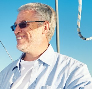
In general, being too dressed down or too dressed up (think tuxedo for men, for example) may also give the impression that you are not willing to adapt yourself to a work environment but instead have your own agenda which will always or often trump the employer’s. So only if (1) one has an independent source of income, and LinkedIn is not a significant source of career or business leads or (2) these details are actually related to one’s career or business (e.g., if the man above were involved in marine work), would such a LinkedIn profile picture make sense. This is where the “LinkedIn is not Facebook” distinction comes into play. LinkedIn is about work, not pleasure, so wear your work face (presentation, wardrobe, etc.)
I should add that if you look closely at the man’s face, the top half of his face is in shadow and the bottom half is in sun. Once you notice this element of the photograph – as some of your LinkedIn viewers will do – the uneven lighting is quite distracting and casts a soft shadow (pun intended) on your attention to detail. In this image, it is not as pronounced as in other photographs I have seen.

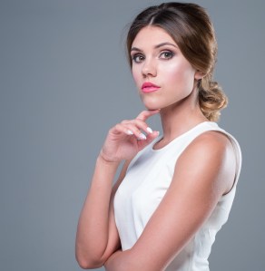
There is a lot I like about the shot above. It is clean, interesting and engaging. But don’t miss little details. The red nail polish, that is, has got to go. It is out of character and distracting, and it shows a lack of attention to detail.

This is a good shot in many ways, although the person is not looking into the camera, and the cropping is quite close. In an artistic field (for example), this may be appropriate, but not in a corporate setting.

When I look at the above shot, I can’t help but wonder if the individual dresses like this all the time and if it conveys his “true self.” Not all of us need to be in suits, and some people prefer LinkedIn to express how they will show up every day. If that is your personal brand, then this sort of image may work.

In this shot, the person’s shoulders are off-kilter, which is distracting and could subtly take away from her credibility. The background is also overwhelming – especially the lights – as is the lipstick. If this person were my client, I would suggest she try again with a new shot.
For this last one, I would say watch the sleeveless look as well as the posture and “pout.” Again, LinkedIn isn’t Facebook. Would you wear it for a meeting with the CEO? If not, it’s not the right look.
Anne Marie Segal is a career and leadership development coach, author, resume strategist and member of Forbes Coaches Council. She is founder of Segal Coaching, author of Master the Interview: A Guide for Working Professionals (available on Amazon.com) and a frequent public speaker in New York, Connecticut and beyond.
Image credits above: Adobe Images.

For examples of “good” LinkedIn profile pictures, see https://annemariesegal.com/2017/06/26/good-linkedin-profile-pictures-what-do-they-actually-look-like.
LikeLike